To the annoyance of people around me, I aways point out poorly kerned text and have even not used a company or stopped watching a TV series with incorrect kerning. Just because it’s bugging me and makes me cross that no-one has spotted it looks incorrect. It’s the designer in me. I know this because when I mention it to other people, they often say “oh yeah” and “it doesn’t matter though”. Even if other people don’t notice, I still feel it makes a difference and worth the extra care. After all, people are paying for my skill and experience, so I want to deliver correct work.
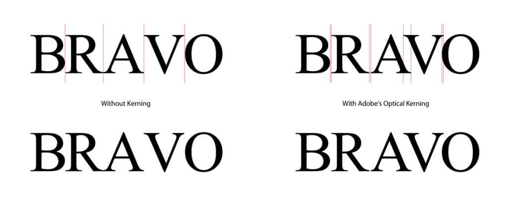
The main reason for improper kerning is down the program or knowledge you have about type. For 95% of the type I layup, I rely on the professional Adobe programs I use to space text correctly with their optical tracking, which looks at each character and depending on which one its next to, adjust accordingly. For example when a capital A is next to a capital V you will see a massive difference between the two options. The other 5% will be larger text (like headings) and although I’ll still select optical tracking, I’ll give it a closer look to see if any characters require additional kerning tweaks.
kerning examples
When I do logos, I always do the additional checks as incorrectly kerned text can make people read your company name incorrectly and in some cases it can result in a rude word. (googling ‘kerning fails’ should bring up some good examples).
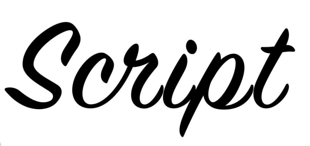
There are some exceptions. Some script fonts don’t require kerning as they often join up (especially handwriting fonts), so the characters need to butt up to each other. Selecting optical tracking on these type of fonts will result in the characters not joining up correctly.
Script kerning example
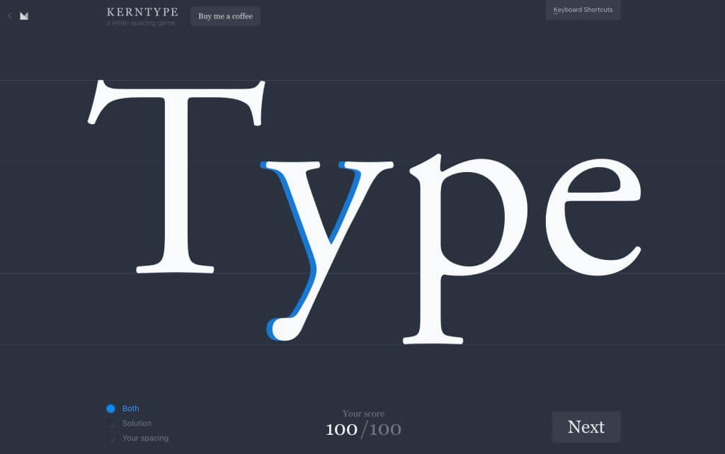
If you want to test your kerning skills, I recommend this fun letter spacing game from Mark MacKay.